


A vehicle is a moving billboard with an extremely short “glance time” — often just 2–3 seconds to convey your message. That’s why the design isn’t just about looking “pretty” — it must be readable, memorable, and technically feasible on a real car body.
Below are ten golden rules we follow to combine visual impact with uncompromising clarity and lasting durability.
1) One Core Message, One Goal
The most important thing on your vehicle should be one clear focus — your brand, service, or a specific offer. Everything else is secondary.
If the viewer remembers only one thing, what should it be? Leave enough “breathing space” around it and resist the urge to list all your services — the shorter the message, the more memorable it becomes.
2) Clear Typographic Hierarchy
Organize information by importance:
-
Brand/logo
-
What you do (a short promise or benefit)
-
One contact (website or phone number).
Use the largest font for the first, medium for the second, and smallest for the third.
Multiple contacts, social icons, and QR codes all at once distract and reduce conversion.
3) Text Size Matches Viewing Distance
A practical rule: about 1 cm letter height for every 3–4 meters of reading distance.
If you want readability from ~20 m, go for at least 6–7 cm letters for the main text; for 30 m – 8–10 cm.
On the rear (in traffic), a phone number or URL of 7–10 cm works perfectly.
Avoid long words in ALL CAPS — they’re harder to read. Use capitals only for short highlights.
4) High Contrast and a Clean Background
Text over busy photos or with low contrast (like yellow on white or dark gray on black) kills legibility.
Use contrasting color pairs, and if you must include an image, place it behind a semi-transparent dark/light overlay.
Test your design in black and white — if it’s still readable, the contrast is strong enough.
5) Two Fonts Are Enough
Combine one font for headlines and one for body text.
Avoid ultra-thin weights and decorative scripts for key information — keep those for accents.
Increase letter spacing slightly for distance reading and never stretch text horizontally.
6) Short Phrases and Powerful Words
“3–5 words” is the golden standard for side panels.
Think like a billboard: one benefit, one reason “why us,” one contact.
Instead of “Professional fleet branding with high-quality materials,” say “Fleet Branding. Premium Vinyl.”
7) Smart Use of Imagery and Color
If you use photos or textures, never place text over detailed areas.
Apply color blocking — bold, solid color sections that reinforce the brand and provide a readable base.
For gradients, ensure they don’t intersect text with similar brightness levels.
8) Positioning on the Vehicle Body
Don’t place key text across seams, handles, trims, or sliding doors.
Align graphics with the car’s actual lines and plan for seams in the print layout.
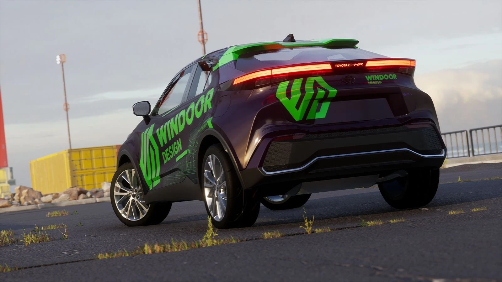
On the rear, position contact info in the upper third — visible above the bumper and in traffic.
Remember: the rear is seen the longest, followed by the left side (overtaking side).
9) One CTA and a Thoughtful QR Code
Pick one main channel: a short URL or a phone number.
A QR code is great for parking and pedestrian zones; in motion, it’s mainly useful on the rear.
Rule of thumb: for scanning from 1–2 meters, make it at least 3–4 cm in size with clear space around it.
Avoid placing QR codes on curves or near seams.
10) Brand Integrity, Materials, and Longevity
Keep clear space around your logo per your brand guidelines — don’t stretch or distort proportions.
Consider how colors will appear both in print and as solid vinyl.
Plan small details to avoid peeling on edges and curves.
Add lamination (matte or satin) to protect legibility and reduce glare.
A well-designed vehicle catches the eye, tells your brand story in a few strong words, and makes people reach for their phone.
If you’d like, we can adapt your visual identity to your specific car model and prepare print-ready and layout files, so your very first kilometer starts working for your brand from the day of installation.